En el canal de YouTube siguen los tutoriales del libro Gatos y Flores. Esta serie está dedicada a las nochebuenas.
Aquí les dejo la liga al último video.
_________________________________________________________________________________
On the YouTube channel the tutorials from the book Gatos y Flores are updated. This particular series is dedicated to poinsettias.
Here is the link to the latest video.
https://www.youtube.com/watch?v=yRRVgJ8_geM
jueves, 29 de diciembre de 2016
domingo, 18 de diciembre de 2016
Tutorial: Nochebuena en el libro Gatos y Flores / Poinsettia tutorial from the book Gatos y Flores.
Tuve unas dos semanas muy pesadas con exámenes finales en ambas escuelas y, una certificación de Cambrigde (CAE) que tuve que presentar yo misma. Añado que tuve que ir al hospital oftalmológico por un problema en mis ojos... tiempos difíciles.
Aquí tienen una liga al primer tutorial de mi libro Gatos y Flores. Es tiempo de Navidad, así que serán unas flores de Nochebuena híbridas las que serán coloreadas. ¡Espero les guste!
______________________________________________________________________________
I had a difficult week with final exams at the school and a CAE certification that I had to take myself. Adding to this was a hospital visit due to an eye problem... tough times.
You have here a link to my youtube channel with the first tutorial of my book Gatos y Flores. It's X-mas time so a hybrid Poinsettia will be colored. I hope you like it!
https://www.youtube.com/watch?v=dDvWBpuBOtc
jueves, 8 de diciembre de 2016
Vista: My libro para colorear/ Flipthrough: My own coloring book

He decidido hacer un video corto donde se ven todas las imágenes que están en el libro y la información de las plantas y flores que las acompañan. El libro es impreso en cartulina opalina, no hay versión electrónica o en inglés de momento. Esto requiere de más tiempo para preparar las traducciones y los registros correspondientes.
El precio de venta será de: 200 pesos y hay opción de mandarlo por correo certificado en México, y paquetería internacional si lo desean. Necesitarían dejar en la caja de mensajes su código postal y ciudad para cotizar el precio del envío.
Espero que les guste el libro, lo adquieran directamente conmigo (no está a la venta en ninguna tienda de libros), Espero que sigan en este blog los tutoriales que estaré haciendo para las páginas de mi libro.
_____________________________________________________________________________
I've decided to shoot a short video where you can see all the images and the information on each plant and flower depicted (only in Spanish). The material is printed on special carboard so any technique can be used. There is no e-book or English version available at the moment. This versions will require a bit more work for the next year. As different registrations and certificates are needed.
The price will be: 200 Mexican Pesos, and there is option to send it by certified mail. in Mexico There will be shipping options to other parts of the world if desired. Postal codes and cities might be needed to calculate shipping, so you can leave a message here.
I hope you like the book and that you have got the chnace to buy it directly with me (It is not available right now at bookstores in Mexico). I invite you to follow this blog for the tutorials I will be posting on coloring some pages of my book.
martes, 8 de noviembre de 2016
Tutorial Lost Ocean.
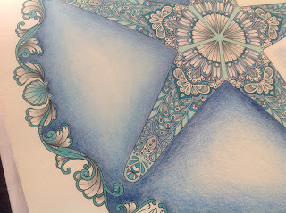
Esta vez, elegí una paleta de color con azules, verdes y grises. Los colores iniciales fueron los siguientes:
This time I chose a color palette with blue, green and grey. The initial colors were these:


______________________________________________________________________________
Empieza con las secciones más grandes con un color claro, este es PC aquamarine. Luego con uno un poco más oscuro que el anterior para colorear otras zonas adyacentes.
Start with the biggest section with a light color, this is PC aquamarine. Then with another darker shade color adjacent color sections.


_______________________________________________________________________________
Después de aplicar los colores, noté que las lineas y los detalles eran demasiado pequeños para seguir aplicando color; así que añadí a la paleta de color plumones de punta delgada. Estos son Maped Color Peps y Stabilo. A tu gusto colorea los detalles y deja zonas en blanco. Es un error no considerar el blanco de las hojas como un color para combinar con tu paleta de colores.
After laying down the colors, I noticed that the lines and details in the drawing were too small for color pencils like the ones I was using, so I decided to add felt pens. These are Maped Color Peps and Stabilo. Decide the sections you want to color using felt pens and leave some areas in white, It is a mistake not to use the white paper as a color as it is another option that combines with your color palette.


_________________________________________________________________________________
Una vez terminado el dibujo, es hora de pasar al fondo. Para este fondo utilicé únicamente colores Derwent. Los tres colores son: azul oscuro, medio y claro.
Hay que aplicar primero el color oscuro en manera suave y en capas, luego el tono medio, y al último el tono más claro. Para suavizar el degradado, usé un poco de algodón y mezclé las tres capas con movimientos suaves y circulares.
Once the line art is done, it's time to color the background. For this I used only Derwent color pencils. The colors are: dark, medium and light blue.
Lay the dark blue first, then the midtone and finally the light blue. Use soft movements and try to work in layers. To soften the ombre effect that you created, use a cotton swab. Try to use gentle and soft circular movements to blend the colors.


Espero les haya gustado el resultado.
I hope you liked the result.
miércoles, 2 de noviembre de 2016
Bullet Journal / Planner
Tengo varios proyectos de coloreado en proceso, en diferentes libros que he comprado (y los que me faltan por llegar en la próxima semana). También tengo pendiente un registro ISBN que está por concluirse este mes y que al fin me permitirá auto-publicar mi propio libro para colorear. No me dedico a dibujar o ilustrar, ni siquiera colorear, para obtener un sueldo. Mi modus vivendi es la docencia: por lo que los videos, las entradas aquí y las clases que doy tienen que organizarse de manera perfecta.
Por lo anterior, decidí comprar un planeador de actividades o una agenda física (he intentado con el ipad y no me ajusto). Vi muchos modelos y no me gustaron. Luego vi la sugerencia de hacer un bullet journal y me agradó la idea de complementarlo como un planeador. Así que manos a la obra: conseguí un cuaderno journal en blanco y a planear el diseño de manera espontánea y como vayan surgiendo las ideas.
Estas fotos representan el diseño base, aún no hay muchos colores en las páginas ni diseños con plumas de gel. Se los pongo para que se den una idea de lo que puede hacer con una hoja en blanco, y que es un reto creativo. Una vez que termine el mes de noviembre pondré un video en mi canal donde se vean ya las páginas terminadas.
_______________________________________________________________________________
I have several projects going on using different coloring books (and yet, I am missing the ones I've just recently bought for next week). I also have my ISBN number pending in order to self-publish my own coloring book this month. I do not have a paid job as an artist or colorist, believe it or not I am an educator and that is my modus vivendi. That's the reason why all my activities need to be perfectly organized.
I wanted a planner or a diary to organize everything I need to do, but the ones I saw didn't convince me much. Then I saw the bullet journal option, and I thought about complementing it as planner. So, I got a journal with white pages and I started the basic design, as spontaneous as I could.
These pics are the basic designs of the pages, no color, no gel pens. This is for you to get an idea on what to do with a blank page and start the creatuve challenge to start from scratch. Once November is due I will make a video for my youtube channel to let you see the finished pages of the month.


miércoles, 12 de octubre de 2016
Coloreando sobre imágenes en tonos grises / Coloring on grayscale images
Para muchos tomar una imagen en tonos grises y colorear, no tiene mucho chiste. La verdad es que si se hace bien el experimento se puede aprender mucho de sombras y luces. Este va a ser el experimento de esta semana. No habrá tutorial en video pues tengo pendientes otros dos y hay que terminarlos.
La imagen elegida es de mi propia autoría en un viaje realizado a San Miguel de Allende, Guanajuato en México. La imagen es de la catedral. Aquí se ve la foto original y la ya tratada en tonos grises. Conforme vaya avanzando el coloreado iré actualizando la entrada de este blog para que vean el proceso completo,
Semana de exámenes en las dos escuelas. No se pudo avanzar mucho de esa imagen. Actualizo al final las fotos de los dos archivos en tonos gris que estoy trabajando.
Más fotos del proceso. En este momento estoy comenzando con el cielo.
________________________________________________________________________________
For some people coloring a grayscale image is not really interesting. The truth is that if the experiment is done well, you can learn a lof about shadow and light. This is going to be the experiment of the week. No video tutorial on this image as I have other two pending to finish.
The chosen image is the photo I took during a trip to San Miguel de Allende in Guanajuato, Mexico. The image is from the cathedral. You are able to see the original photo and the grayscale one that I prepared to color. As I am coloring I will update this post for you to see the complete process.
Exam week at school. Little time to color. Here is the update with the files I am working on.
More fotos of the process. Right now I am starting the background.


Close up:


domingo, 9 de octubre de 2016
Colorea Conmigo / Color Along
Normalmente no me agrada estar viendo videos en YouTube de más de veinte minutos. Me parece que no utiliza uno el tiempo adecuadamente. Sin embargo, muchos de los canales de coloreado que hay actualmente ponen videos de entre una hora y hora y media para mostrar sus procesos de colorear. Así que haré uno dividido en tres o cuatro partes de 10 minutos para que vean el proceso que utilizo para colorear.
En cuanto tenga el video listo, haré menciones en las páginas de redes sociales para los que gusten verlos. Estos son los sitios:
Facebook: https://www.facebook.com/retratartetradicional/
Twitter: @chriskilue
Instagram: chriskilue
YouTube: https://youtu.be/BCJLZoarq6s
_________________________________________________________________________
Normally I dislike watching videos on YouTube that last more than twenty minutes. I think it is a waste of time. However, lots of the coloring channels on YT upload videos from one hour to one hour and a half to show their coloring process. So, I will create one that will be divided in three to four parts so you can see my coloring process.
As soon as I have part one of the video, I will announce them on social networks. These are the sites:
Facebook: https://www.facebook.com/retratartetradicional/
Twitter: @chriskilue
Instagram: chriskilue
YouTube: https://youtu.be/BCJLZoarq6s

domingo, 2 de octubre de 2016
Acentos en paletas de colores parte 2 / Accents in color palettes part 2
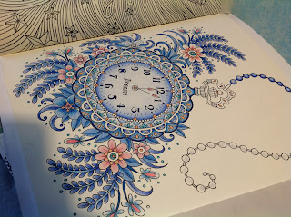
Como prometimos, esta es la segunda parte de elegir paletas de colores y trabajar con acentos de color. El dibujo elegido es del libro Summer Nights de Hanna Karlzon. Elegí el reloj de bolsillo para aplicar una bonita paleta de colores azul con acento rosa. Estos fueron los materiales:
As promised, this is the second part of how to choose colors and work with color accents. The chosen drawing is from the book Summer Nights by Hanna Karlzon. I chose the pocket watch to apply a beautiful palette of blue colors with a pink accent. These are the materials.


As promised, this is the second part of how to choose colors and work with color accents. The chosen drawing is from the book Summer Nights by Hanna Karlzon. I chose the pocket watch to apply a beautiful palette of blue colors with a pink accent. These are the materials.


Mi proceso de dibujo es un tanto ecléctico, voy probando diferentes zonas y definiendo las zonas de acento de color en lo que voy trabajando. Tengo muchos años de experiencia coloreando por lo que es ya instintivo. La recomendación es que saques una fotocopia del dibujo a colorear y experimentes en esa zona antes de pasar al libro.
Poco a poco se van trabajando las zonas, siempre con una presión suave y aplicando capas en sentidos opuestos para mantener uniformidad.
Mi drawing process is not methodical, I am testing different areas and definig the accent zones as I work. I have colored for a long time, so this is very intuitive for me. As a recommendation, you can make a copy of your drawing and experiment the materials there before moving on to the book.
Little by little the areas are covered in color with soft pressure and layering colors from different directions to keep it consistent.


Los acentos van en lugares pequeños, o en un solo lugar para llevar la atención del espectador a cierta zona. En este caso el dibujo es muy detallado y se puso el rosa en lugares pequeños y en las flores.
The accents go on tiny details, or just in one particular zone to get the viewer's attention to that area. In this case the drawing has a lot of detail, and pink was used in those details and the flowers.

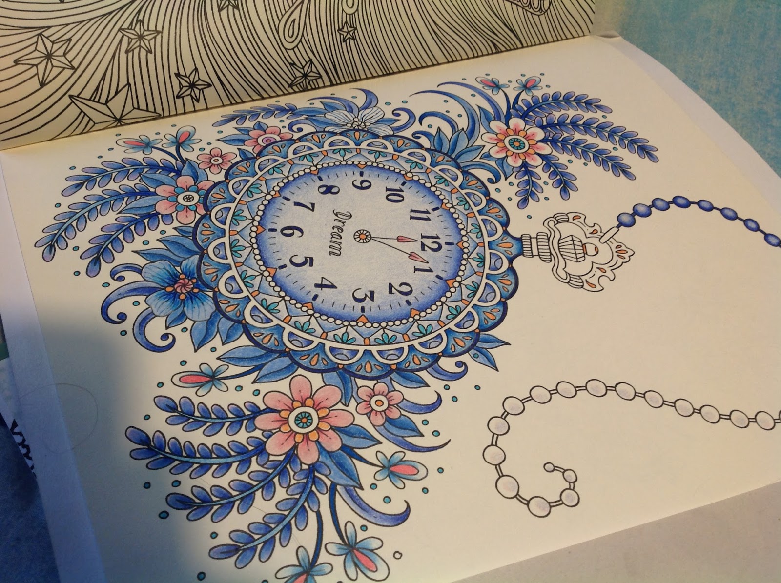


Con paciencia y dedicación puedes crear combinaciones hermosas sin otra herramienta más que una paleta de color que te guste.
With patience and dedication, you can create beautiful combinations with a color palette you like.


Así que a tomar tus colores, buscar las paletas de color en Internet y a colorear se ha dicho.
So grab your colors, and find color palettes in the Internet to start working.
miércoles, 28 de septiembre de 2016
Eligiendo mis lápices de color parte 1 / Choosing color pencils part 1
Seguramente has visto en YouTube tutoriales con gente que tiene sets de colores de 72, 120 o 150 colores y te mueres de ganas en tener algo de esas marcas. Sí, es algo que se entiende perfectamente: tener cientos de colores para poner páginas multicolor. El problema es que esos sets son caros, y si tienes el presupuesto adelante...si no pues hay que aprender a elegir los colores que te sirven y que no tengas que invertir mucho dinero en ellos. Además de cuidar tu presupuesto y no elegir colores excesivamente caros que luego no puedes substituir inmediatamente comprando colores individuales.
Los lápices de color tienen tres grados: el típico escolar, el de estudiante de arte y el de artista profesional.
Escolar: son las marcas que comúnmente encuentras en el supermercado y que van en precios desde 35 a 60 pesos. Tienen minas de color (el centro) con mucho adhesivo y son resistentes. Si se cae al piso, la mina no se rompe. La desventaja es que hay que presionar mucho para colorear, lo que a la larga daña las manos o se rompe el papel. No son colores que mezclen bien entre ellos. No los recomiendo.
Estudiante de arte: Tienen menos adhesivo en la mina y resisten bien. Si se caen hay riesgo de que se rompa la mina por dentro, y te encuentres con minas rotas cada vez que sacas punta. Mezclan entre ellos lo suficientemente bien para usarlos en los libros de colorear para adultos. Sus precios van desde 80 a 150 pesos dependiendo de la marca.
Artista Profesional: Son justamente esos sets que adoras ver en YouTube. Muchos colores, en armonías y tonos. Mezclan muy bien pues casi no tienen adhesivo y son mucho pigmento suave. He ahí que debes de tener mucho cuidado con ellos. Si se caen al piso, la mina interna se rompe y cuando saques punta quedarás con lápices de puntas rotas y te los acabarás muy pronto dando al traste tu inversión. Los precios por sets varían de acuerdo al tamaño y marca. Van desde 250 pesos a 4000. Si te decides a invertir en uno de estos sets es mejor un set de 24 colores, con ellos tienes suficientes para mezclar. Hay marcas que no venden los colores individualmente si se te acaban (Prismacolor es de ellos), así que cuidado con romper las minas.
En la siguiente entrada, veremos los colores que tienen propiedades de acuarela y que dependiendo del tipo de papel del libro puedes elegir para colorear.
__________________________________________________________________________
Surely, you have seen on YouTube tutorials with people who have color sets of 72, 120, or 150 colors, and you die for getting one of those sets. Yes, I understand: having hundreds of colors to get multicolored pages. The problem is those sets are pricey, but if you have the budget go ahead and get one... If not, then you need to choose the colors you need without investing lots of money in colors. Apart from having a budget, you will not be getting expensive sets that you cannot substitute with individual colors.
Color pencils have three quailities: school, art student, and professional artist.
School brands: Common ones found at the supermarket with affordable prices. The cores have a lot of adhesives and they resist breaking. If you drop it, nothing happens. The biggest disadvantage is that these colors do not blend or mix well with others, and you have to press your hand down to lay the colors. I do not recommend them.
Art student brands: Less adhesive and resistant. If you drop them, there is the risk to break the core, and then you will find broken tips everytime you sharp the pencils. They have good blending and mixing, so they are good to use for coloring books. They are more expensive, but quite affordable.
Professional artist brands: These are just the sets you adore from YouTube. Lots of colors in harmonic shades. These colors have excellent mixing and blending characteristics. Here you need to have a lof of care: do not drop them at all, keep them safe. If you don't the cores break and you will waste expensive material in sharpening your colors. These sets are quite expensive, and some brands do not offer to substitute individual colors. It depends on the country, If you decide to invest in one of them, get a 24 color set better. You will have enough colors to blend and mix and get even more colors.
The next post will be about watercolor pencils and how to use them depending on the paper you have got in your coloring book.
domingo, 25 de septiembre de 2016
Dibujo con Bicolores / Bicoloured Drawing
Para empezar a colorear (sin frustrarte), no es necesario tener 150 colores (ni la inversión de dinero que eso significa). Lo primero es aprender a poner capas de color para crear nuevos colores y efectos.
Nada mejor que un bicolor azul/rojo para aprender lo anterior. Busca un simple lápiz bicolor en la papelería de la esquina (o en las grandes que los venden por paquete), y a practicar se ha dicho.
En mi canal de You Tube hay tres videos tutoriales al respecto. Puedes entrar al canal, siguiendo el menú a tu derecha.
Este dibujo es un ejemplo de lo que pueden lograr unos humildes bicolores:
El dibujo es de la artista australiana Peta Hewitt, quién me dio permiso para utilizarlo para este tutorial.

To start coloring without frustrating, it is not necessary to get a 150 color set (nor the money it is needed to invest in that). The first thing you need to learn is to create color layers to give effects, and of course create colors. The best thing to do is to get a bicoloured pencil (blue and red). Get one at your closer store and get ready to practice.
On my You Tube channel there are three videos devoted to this bicoloured technique. You can access the channel using the menu on your right.
This drawing is an example of what you can get by layering two colors. The line art is by Australian artist Peta Hewitt, who gave me permission to use it for this tutorial.
Acentos en paletas de colores parte 1 / Accents in color palettes part 2
Al utilizar paletas de colores que se pueden obtener de Internet (sitios como Pinterest tienen tableros dedicados a ellos) es importante no solamente elegir la paleta de colores, hay que saber identificar el acento. Un acento es una pequeña área de color que es notablemente diferente al resto de los colores de la composición (Gurney, 2010). En otras palabras, es aquella parte a la que el ojo se ve atraído y resalta. Los colores que se utilizan como acentos son normalmente complementarios o casi complementarios del color dominante; son también más vibrantes.
Cuando elijas una paleta de color, fíjate no únicamente en los colores y la manera en la que armonizan...ve en la fotografía cómo se aplica el acento y llévalo a tu dibujo para colorear. Fíjate en esta paleta elegida de Design Seeds (Una de mis favoritas y que está en mi tablero en Pinterest). El acento se representa en la fruta y los dos colores anaranjados. El color predominante es el azul en sus diferentes opciones. El naranja es color complementario del azul en el círculo cromático, pues están exactamente opuestos uno a otro.


Cuando elijas una paleta de color, fíjate no únicamente en los colores y la manera en la que armonizan...ve en la fotografía cómo se aplica el acento y llévalo a tu dibujo para colorear. Fíjate en esta paleta elegida de Design Seeds (Una de mis favoritas y que está en mi tablero en Pinterest). El acento se representa en la fruta y los dos colores anaranjados. El color predominante es el azul en sus diferentes opciones. El naranja es color complementario del azul en el círculo cromático, pues están exactamente opuestos uno a otro.

Esto quiere decir que tu color de acento, o dos colores como máximo, no deben de llenar tu dibujo de color y ser predominantes. Deben de usarse en pocos lugares de tu dibujo para que no se convierta en el color dominante..
En la segunda parte de esta entrada, verás un ejemplo de acentos con un dibujo para colorear que tomé del libro Summer Midnights de Hanna Karlzon. Este es un avance:

Referencias:
Gurney, J (2010). Color and Light. Pg:118-119. Andrews McMeel Publishing, LLC: Kansas, City.
_____________________________________________________________________________
When using color palettes from the Internet (Pinterest has pinboards with these palettes) it is important to choose not only a palette, but the accent. An accent is this area of color that is different from the rest of the composition (Gurney, 2010). In other words, it is this area highlighted attacted to the eye. The colors used in accents are complementary, or near complementary, colors of the dominant color. They are also more vibrant.
When you choose your palette, pay attention to the picture (not just how colors harmonize), see how the accent is used, and take the idea to your coloring page. Look at this palette choosen from the site Design Seeds (it is one of my favorites on my Pinterest board). The accent is the fruit and its two orange shades. The predominant color is blue in all its options. Orange is a complementary color of blue on the chromatic circle, as they sit opposite from each other.

This means that your accent, or two accent colors, should not be dominant on your coloring page. This accent color, or colors, should be used in small areas.
In the second part of this post, you will see an example with accents used on a coloring page from the book by Hanna Karlzon, Summer Midnights. This is a quick look:

References
Gurney, J (2010). Color and Light. Pg:118-119. Andrews McMeel Publishing, LLC: Kansas, City
jueves, 15 de septiembre de 2016
Escogiendo mi libro para colorear parte 2 / Choosing a coloring book part 2

Una vez elegido el libro que deseo colorear, es importante protegerlo de la luz y el polvo. Los libros vienen impresos en diferentes calidades de papel. Los más económicos pueden tener desde papel bond o ahuesado, y los más caros papel especial para dibujo. El papel de los libros con calidad tiene el suficiente grosor para trabajar con diferentes materiales como lápices de color, marcadores, plumones, o acuarelables.
Si en este momento no tengo el presupuesto para comprar un libro de colorear, puedo buscar en Internet pàginas para colorear de autores reconocidos. Ellos ponen a disposiciòn del pùblico algunos dibujos en pdf que pueden imprimirse en diferentes tipos de papel, y asì disfrutar de esta experiencia.
Lo màs importante es que al comprar un libro, puedas hojear las pàginas y decidir si te gustarìa colorearlo; si no te gusta al hojearlo, hay muchas opciones para elegir. Si estàs comprando en lìnea, entonces puedes ver en YouTube los videos populares de coloristas que hojean las pàginas de varios libros. Asì puedes elegir cuàl te gustarìa comprar.
Así que ya armados con tu libro (o libros) en la siguiente entrada, veremos la mejor opción de lápices de colores para empezar a colorear y practicar. Más adelante hablaremos de otros materiales económicos que te van a ayudar con tu coloreado y te darán buenos resultados.
_____________________________________________________________________
Once you have chosen your coloring book, it is important to protect it from light and dust. The books are printed in different paper qualities. The easy-accesible books cand have common bond paper and not heavy paper, and the most expensive books can have heavy paper made for mixed materials like markers, color pencils or watercolor pencils.
If in this moment I do not have the budget for a complete book, I can look for Internet pages by famous illustrators. They offer free pdf files that you can print, and enjoy the coloring experience.
The most important thing when buying a book is to check the pages to decide if you would like to color them. If you don't like the book after flippig its pages, there are more options at the book store. If you have decided to buy online, you can check the flip-out videos of popular coloring artists, or hobbyist who show pages of those books on short videos. Check them out before you buy.
Now that you have your book (or books), on the next post we will see the best option for color pencils to start practicing your coloring. Later We will talk about other materials that can help you with your coloring, and that give good results. Plus, these materials are not pricey.
lunes, 12 de septiembre de 2016
Escogiendo mi libro para colorear parte 1/ Choosing a coloring book part 1
Con la moda actual de los libros para colorear, hay una locura impresionante en sitios como YouTube donde coloristas, y alguno que otro profesional ponen en video las opiniones acerca de tal o cual libro. También he visto coloristas asombrosos que ponen hasta videos de una hora, o más, con el proceso que utilizan para colorear. (¿Quién tiene tiempo de ver un video de una persona coloreando?)
En fin, antes de emocionarte y pedir los libros que veas en video, o que te coman las ansias por colorear como se ve lo hacen estas personas, necesitas definir que tipo de libro necesitas de acuerdo a tu personalidad:
Si tu personalidad es activa y no puedes dedicarle muchas horas a colorear (aunque sea por relajarse), y te gusta ver los resultados rápido...NUNCA escojas un libro con detalles minúsculos o muy pequeños. Te vas a desesperar y lo vas a abandonar muy pronto. Un libro con figuras florales (grandes), geométricas (como mandalas) sería bueno para ti.

Si tu personalidad es ansiosa, nerviosa y buscas relajarte, y puedes dedicar un poco más de tiempo para poder entrar a ese estado de relajación...ESCOGE libros con mandalas y flores o plantas. Sobretodo aquellas que tienen patrones repetitivos en toda la hoja. Una vez que elijas los colores, no tendrás problemas en terminar el coloreado, ni te distraerá el pensar que color le va a que detalle.

Si tu personalidad es tranquila, te gusta la atención a los detalles y a la calidad; sobretodo, tienes mucho tiempo para colorear a lo largo del día...ESCOGE libros con ilustraciones pictoricas (ya sean muy detalladas o no), libros de películas (hay de Harry Potter, GOT, Dr. Who, etc) Aquí si disfrutarás no solamente eligiendo la paleta de colores, también pondrás atención a los detalles.

En la segunda parte de esta entrada hablaremos de que otras opciones hay para colorear, y que puedas planear tu presupuesto de libros y material.
__________________________________________________________________________
With the trend of adult coloring books, there is a great madness on sites like YouTube where amateur and professional colorists upload videos with their opinions on certain books. I've seen colorists uploading videos of one or more hours to show their coloring process. (Anyway, who's got time to what an hour plus video nowadays?)
Before you go crazy buying coloring books you see on video, or want to color as these people do, you need to define the type of book you need according to your personality:
If you are an active person who cannot dedicate so much time to coloring (even if you want to relax by doing this), and you want to see fast results... NEVER choose a book with small details, or with excess details on each page. You will get tired soon, and abandon this coloring hobby. A book with flowers (big drawings), geometric figures (like mandalas) is your choice.

If your personality is a bit nervy, or anxious, you want to relax, and you can dedicate some time to color during the day...PICK a book with mandalas or figures that are repetitive throughout the page. Once you have chosen your color palette, you won't have problems in finishing the complete page, and nor will you worry about which color fits that tiny detailed petal.

In the second part of this post, we will talk about other options to color, and we will touch the topic of budget for books and material.
En fin, antes de emocionarte y pedir los libros que veas en video, o que te coman las ansias por colorear como se ve lo hacen estas personas, necesitas definir que tipo de libro necesitas de acuerdo a tu personalidad:
Si tu personalidad es activa y no puedes dedicarle muchas horas a colorear (aunque sea por relajarse), y te gusta ver los resultados rápido...NUNCA escojas un libro con detalles minúsculos o muy pequeños. Te vas a desesperar y lo vas a abandonar muy pronto. Un libro con figuras florales (grandes), geométricas (como mandalas) sería bueno para ti.

Si tu personalidad es ansiosa, nerviosa y buscas relajarte, y puedes dedicar un poco más de tiempo para poder entrar a ese estado de relajación...ESCOGE libros con mandalas y flores o plantas. Sobretodo aquellas que tienen patrones repetitivos en toda la hoja. Una vez que elijas los colores, no tendrás problemas en terminar el coloreado, ni te distraerá el pensar que color le va a que detalle.

Si tu personalidad es tranquila, te gusta la atención a los detalles y a la calidad; sobretodo, tienes mucho tiempo para colorear a lo largo del día...ESCOGE libros con ilustraciones pictoricas (ya sean muy detalladas o no), libros de películas (hay de Harry Potter, GOT, Dr. Who, etc) Aquí si disfrutarás no solamente eligiendo la paleta de colores, también pondrás atención a los detalles.

En la segunda parte de esta entrada hablaremos de que otras opciones hay para colorear, y que puedas planear tu presupuesto de libros y material.
__________________________________________________________________________
With the trend of adult coloring books, there is a great madness on sites like YouTube where amateur and professional colorists upload videos with their opinions on certain books. I've seen colorists uploading videos of one or more hours to show their coloring process. (Anyway, who's got time to what an hour plus video nowadays?)
Before you go crazy buying coloring books you see on video, or want to color as these people do, you need to define the type of book you need according to your personality:
If you are an active person who cannot dedicate so much time to coloring (even if you want to relax by doing this), and you want to see fast results... NEVER choose a book with small details, or with excess details on each page. You will get tired soon, and abandon this coloring hobby. A book with flowers (big drawings), geometric figures (like mandalas) is your choice.

If your personality is a bit nervy, or anxious, you want to relax, and you can dedicate some time to color during the day...PICK a book with mandalas or figures that are repetitive throughout the page. Once you have chosen your color palette, you won't have problems in finishing the complete page, and nor will you worry about which color fits that tiny detailed petal.

If you have a relaxed nature, you enjoy attention to details, and you can dedicate some time to color during the day... PICK books with pictorial ilustrations (detailes or not), books based on movies (Harry Potter, GOT, Dr. Who, etc.) You will certainly enjoy choosing your color palettes, and give all your attention to details.


Suscribirse a:
Entradas (Atom)