Mostrando las entradas con la etiqueta Paleta de Colores. Mostrar todas las entradas

jueves, 15 de junio de 2023

Texturas metálicas con lápices de color. / metallic textures with color pencils.

 Un bonito ejercicio con lápices de colores. Esta vez son una mezcla de Prismacolor premiere, junior, scholar y, Derwent Artists’ . La imagen es de un producto de Amazon. 

———————————————

A nice practice with color pencils. I used Prismacolor premiere, junior, scholar, and  Derwent Artists’ . The images come from an Amazon products.


viernes, 12 de mayo de 2023

Experimentos con combinaciones de color. / Experiments with color combos

 En los últimos dos meses, he estado experimentar con combinaciones de color sugeridas por P.M. Artist Studio en su grupo de. Facebook. Al final dejo las ligas a su canal de YouTube e Instagram. 

La primera no la fotografié a detalle. Fue en abril. La combinación naranja - rosa. Para esta combinación use el libro Lost Ocean de Johanna Basford. Colores de cera y plumines.

Para la de Mayo, la combinación fue plata - gris de Payne. Esta vez son ilustraciones originales experimentando con ceras y acuarela. 

—————————————————

In the last two months, I have been experimenting with the color combos suggested by P.M. Artist Studio published in their Facebook group. At the bottom of the page, you will have links to their YouTube and Instagram.

The first one was not photographed in detail. April : It was the orange- pink combo. I used a page from the book Lost Ocean by Johanna Basford. Just color pencils used and markers.

The second one was finished last week. May: silver and Payne’s grey combo. These two are original works experimenting with wax and watercolor. 


https://youtube.com/@PMartistStudio


https://instagram.com/pmartiststudio?igshid=MTIyMzRjYmRlZg==


martes, 8 de noviembre de 2016

Tutorial Lost Ocean.

Esta vez, elegí una paleta de color con azules, verdes y grises. Los colores iniciales fueron los siguientes:

This time I chose a color palette with blue, green and grey. The initial colors were these:


______________________________________________________________________________
Empieza con las secciones más grandes con un color claro, este es PC aquamarine. Luego con uno un poco más oscuro que el anterior para colorear otras zonas adyacentes.

Start with the biggest section with a light color, this is PC aquamarine. Then with another darker shade color adjacent color sections.


_______________________________________________________________________________
Después de aplicar los colores, noté que las lineas y los detalles eran demasiado pequeños para seguir aplicando color; así que añadí a la paleta de color plumones de punta delgada. Estos son Maped Color Peps y Stabilo. A tu gusto colorea los detalles y deja zonas en blanco. Es un error no considerar el blanco de las hojas como un color para combinar con tu paleta de colores.

After laying down the colors, I noticed that the lines and details in the drawing were too small for color pencils like the ones I was using, so I decided to add felt pens. These are Maped Color Peps and Stabilo. Decide the sections you want to color using felt pens and leave some areas in white, It is a mistake not to use the white paper as a color as it is another option that combines with your color palette.


_________________________________________________________________________________
Una vez terminado el dibujo, es hora de pasar al fondo. Para este fondo utilicé únicamente colores Derwent. Los tres colores son: azul oscuro, medio y claro.
Hay que aplicar primero el color oscuro en manera suave y en capas, luego el tono medio, y al último el tono más claro. Para suavizar el degradado, usé un poco de algodón y mezclé las tres capas con movimientos suaves y circulares.

Once the line art is done, it's time to color the background. For this I used only Derwent color pencils. The colors are: dark, medium and light blue.
Lay the dark blue first, then the midtone and finally the light blue. Use soft movements and try to work in layers. To soften the ombre effect that you created, use a cotton swab. Try to use gentle and soft circular movements to blend the colors.


Espero les haya gustado el resultado.

I hope you liked the result.

domingo, 2 de octubre de 2016

Acentos en paletas de colores parte 2 / Accents in color palettes part 2

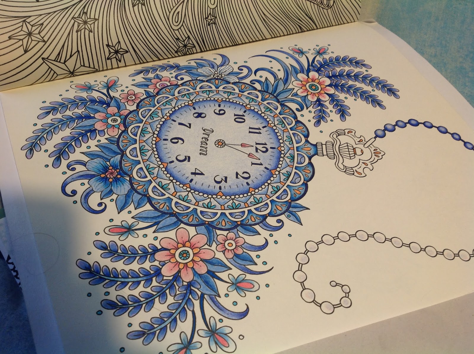
Como prometimos, esta es la segunda parte de elegir paletas de colores y trabajar con acentos de color. El dibujo elegido es del libro Summer Nights de Hanna Karlzon. Elegí el reloj de bolsillo para aplicar una bonita paleta de colores azul con acento rosa. Estos fueron los materiales:

As promised, this is the second part of how to choose colors and work with color accents. The chosen drawing is from the book Summer Nights by Hanna Karlzon. I chose the pocket watch to apply a beautiful palette of blue colors with a pink accent. These are the materials.


Mi proceso de dibujo es un tanto ecléctico, voy probando diferentes zonas y definiendo las zonas de acento de color en lo que voy trabajando. Tengo muchos años de experiencia coloreando por lo que es ya instintivo. La recomendación es que saques una fotocopia del dibujo a colorear y experimentes en esa zona antes de pasar al libro. 

Poco a poco se van trabajando las zonas, siempre con una presión suave y aplicando capas en sentidos opuestos para mantener uniformidad.

Mi drawing process is not methodical, I am testing different areas and definig the accent zones as I work. I have colored for a long time, so this is very intuitive for me. As a recommendation, you can make a copy of your drawing and experiment the materials there before moving on to the book.

Little by little the areas are covered in color with soft pressure and layering colors from different directions to keep it consistent. 


Los acentos van en lugares pequeños, o en un solo lugar para llevar la atención del espectador a cierta zona. En este caso el dibujo es muy detallado y se puso el rosa en lugares pequeños y en las flores. 

The accents go on tiny details, or just in one particular zone to get the viewer's attention to that area. In this case the drawing has a lot of detail, and pink was used in those details and the flowers. 


Con paciencia y dedicación puedes crear combinaciones hermosas sin otra herramienta más que una paleta de color que te guste. 

With patience and dedication, you can create beautiful combinations with a color palette you like.


Así que a tomar tus colores, buscar las paletas de color en Internet y a colorear se ha dicho.

So grab your colors, and find color palettes in the Internet to start working. 


domingo, 25 de septiembre de 2016

Acentos en paletas de colores parte 1 / Accents in color palettes part 2

Al utilizar paletas de colores que se pueden obtener de Internet (sitios como Pinterest tienen tableros dedicados a ellos) es importante no solamente elegir la paleta de colores, hay que saber identificar el acento. Un acento es una pequeña área de color que es notablemente diferente al resto de los colores de la composición (Gurney, 2010). En otras palabras, es aquella parte a la que el ojo se ve atraído y resalta. Los colores que se utilizan como acentos son normalmente complementarios o casi complementarios del color dominante; son también más vibrantes.

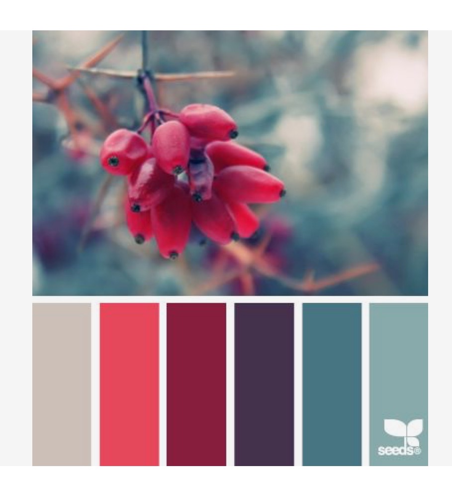
Cuando elijas una paleta de color, fíjate no únicamente en los colores y la manera en la que armonizan...ve en la fotografía cómo se aplica el acento y llévalo a tu dibujo para colorear. Fíjate en esta paleta elegida de Design Seeds (Una de mis favoritas y que está en mi tablero en Pinterest). El acento se representa en la fruta y los dos colores anaranjados. El color predominante es el azul en sus diferentes opciones. El naranja es color complementario del azul en el círculo cromático, pues están exactamente opuestos uno a otro.


Esto quiere decir que tu color de acento, o dos colores como máximo, no deben de llenar tu dibujo de color y ser predominantes. Deben de usarse en pocos lugares de tu dibujo para que no se convierta en el color dominante.. 

En la segunda parte de esta entrada, verás un ejemplo de acentos con un dibujo para colorear que tomé del libro Summer Midnights de Hanna Karlzon. Este es un avance:


Referencias:
Gurney, J (2010). Color and Light. Pg:118-119. Andrews McMeel Publishing, LLC: Kansas, City.

_____________________________________________________________________________

When using color palettes from the Internet (Pinterest has pinboards with these palettes) it is important to choose not only a palette, but the accent. An accent is this area of color that is different from the rest of the composition (Gurney, 2010). In other words, it is this area highlighted attacted to the eye. The colors used in accents are complementary, or near complementary, colors of the dominant color. They are also more vibrant.

When you choose your palette, pay attention to the picture (not just how colors harmonize), see how the accent is used, and take the idea to your coloring page. Look at this palette choosen from the site Design Seeds (it is one of my favorites on my Pinterest board). The accent is the fruit and its two orange shades. The predominant color is blue in all its options. Orange is a complementary color of blue on the chromatic circle, as they sit opposite from each other.


This means that  your accent, or two accent colors, should not be dominant on your coloring page. This accent color, or colors, should be used in small areas. 

In the second part of this post, you will see an example with accents used on a coloring page from the book by Hanna Karlzon, Summer Midnights. This is a quick look:


References
Gurney, J (2010). Color and Light. Pg:118-119. Andrews McMeel Publishing, LLC: Kansas, City

domingo, 11 de septiembre de 2016

Colores suaves / Soft colors

Si eres nuevo coloreando los libros para adultos y, no eres diseñador gráfico o ilustrador seguramente te pone nervioso elegir una paleta de colores. No hay problema, ya hay ayuda en línea.

Design Seeds en su serie Color Sign (si tienen cuenta en Pinterest pueden seguirlos) publican unas paletas de color hermosas que vienen bien para los tan populares libros para colorear destinados al público adulto.

En esta ocasión pongo de ejemplo tres paletas de color suaves que sirven para fondos, flores y hojas.
________________________________________________________________________________

If you are new to coloring adult books, and you are not a graphic designer or illustrator surely you get nervous when choosing a color palette. No problem! Internet is on your side to help you.

Design Seeds in their series Color Sign (follow them on Pinterest if you can) pin beautiful color palettes that suit the trendy adult coloring books.

This time I show three soft palettes that can be used for backgrounds, flowers and leaves.
Colores suaves flores / Soft flower colors

Colores suaves poco brillantes con acentos rojos / Soft colors little brightness with red accents

Colores verdes suaves poco brilantes con acentos en gris. / Soft green colors little brightness with grey accents.