Seguramente has visto en YouTube tutoriales con gente que tiene sets de colores de 72, 120 o 150 colores y te mueres de ganas en tener algo de esas marcas. Sí, es algo que se entiende perfectamente: tener cientos de colores para poner páginas multicolor. El problema es que esos sets son caros, y si tienes el presupuesto adelante...si no pues hay que aprender a elegir los colores que te sirven y que no tengas que invertir mucho dinero en ellos. Además de cuidar tu presupuesto y no elegir colores excesivamente caros que luego no puedes substituir inmediatamente comprando colores individuales.
Los lápices de color tienen tres grados: el típico escolar, el de estudiante de arte y el de artista profesional.
Escolar: son las marcas que comúnmente encuentras en el supermercado y que van en precios desde 35 a 60 pesos. Tienen minas de color (el centro) con mucho adhesivo y son resistentes. Si se cae al piso, la mina no se rompe. La desventaja es que hay que presionar mucho para colorear, lo que a la larga daña las manos o se rompe el papel. No son colores que mezclen bien entre ellos. No los recomiendo.
Estudiante de arte: Tienen menos adhesivo en la mina y resisten bien. Si se caen hay riesgo de que se rompa la mina por dentro, y te encuentres con minas rotas cada vez que sacas punta. Mezclan entre ellos lo suficientemente bien para usarlos en los libros de colorear para adultos. Sus precios van desde 80 a 150 pesos dependiendo de la marca.
Artista Profesional: Son justamente esos sets que adoras ver en YouTube. Muchos colores, en armonías y tonos. Mezclan muy bien pues casi no tienen adhesivo y son mucho pigmento suave. He ahí que debes de tener mucho cuidado con ellos. Si se caen al piso, la mina interna se rompe y cuando saques punta quedarás con lápices de puntas rotas y te los acabarás muy pronto dando al traste tu inversión. Los precios por sets varían de acuerdo al tamaño y marca. Van desde 250 pesos a 4000. Si te decides a invertir en uno de estos sets es mejor un set de 24 colores, con ellos tienes suficientes para mezclar. Hay marcas que no venden los colores individualmente si se te acaban (Prismacolor es de ellos), así que cuidado con romper las minas.
En la siguiente entrada, veremos los colores que tienen propiedades de acuarela y que dependiendo del tipo de papel del libro puedes elegir para colorear.
__________________________________________________________________________
Surely, you have seen on YouTube tutorials with people who have color sets of 72, 120, or 150 colors, and you die for getting one of those sets. Yes, I understand: having hundreds of colors to get multicolored pages. The problem is those sets are pricey, but if you have the budget go ahead and get one... If not, then you need to choose the colors you need without investing lots of money in colors. Apart from having a budget, you will not be getting expensive sets that you cannot substitute with individual colors.
Color pencils have three quailities: school, art student, and professional artist.
School brands: Common ones found at the supermarket with affordable prices. The cores have a lot of adhesives and they resist breaking. If you drop it, nothing happens. The biggest disadvantage is that these colors do not blend or mix well with others, and you have to press your hand down to lay the colors. I do not recommend them.
Art student brands: Less adhesive and resistant. If you drop them, there is the risk to break the core, and then you will find broken tips everytime you sharp the pencils. They have good blending and mixing, so they are good to use for coloring books. They are more expensive, but quite affordable.
Professional artist brands: These are just the sets you adore from YouTube. Lots of colors in harmonic shades. These colors have excellent mixing and blending characteristics. Here you need to have a lof of care: do not drop them at all, keep them safe. If you don't the cores break and you will waste expensive material in sharpening your colors. These sets are quite expensive, and some brands do not offer to substitute individual colors. It depends on the country, If you decide to invest in one of them, get a 24 color set better. You will have enough colors to blend and mix and get even more colors.
The next post will be about watercolor pencils and how to use them depending on the paper you have got in your coloring book.
miércoles, 28 de septiembre de 2016
domingo, 25 de septiembre de 2016
Dibujo con Bicolores / Bicoloured Drawing
Para empezar a colorear (sin frustrarte), no es necesario tener 150 colores (ni la inversión de dinero que eso significa). Lo primero es aprender a poner capas de color para crear nuevos colores y efectos.
Nada mejor que un bicolor azul/rojo para aprender lo anterior. Busca un simple lápiz bicolor en la papelería de la esquina (o en las grandes que los venden por paquete), y a practicar se ha dicho.
En mi canal de You Tube hay tres videos tutoriales al respecto. Puedes entrar al canal, siguiendo el menú a tu derecha.
Este dibujo es un ejemplo de lo que pueden lograr unos humildes bicolores:
El dibujo es de la artista australiana Peta Hewitt, quién me dio permiso para utilizarlo para este tutorial.

To start coloring without frustrating, it is not necessary to get a 150 color set (nor the money it is needed to invest in that). The first thing you need to learn is to create color layers to give effects, and of course create colors. The best thing to do is to get a bicoloured pencil (blue and red). Get one at your closer store and get ready to practice.
On my You Tube channel there are three videos devoted to this bicoloured technique. You can access the channel using the menu on your right.
This drawing is an example of what you can get by layering two colors. The line art is by Australian artist Peta Hewitt, who gave me permission to use it for this tutorial.
Acentos en paletas de colores parte 1 / Accents in color palettes part 2
Al utilizar paletas de colores que se pueden obtener de Internet (sitios como Pinterest tienen tableros dedicados a ellos) es importante no solamente elegir la paleta de colores, hay que saber identificar el acento. Un acento es una pequeña área de color que es notablemente diferente al resto de los colores de la composición (Gurney, 2010). En otras palabras, es aquella parte a la que el ojo se ve atraído y resalta. Los colores que se utilizan como acentos son normalmente complementarios o casi complementarios del color dominante; son también más vibrantes.
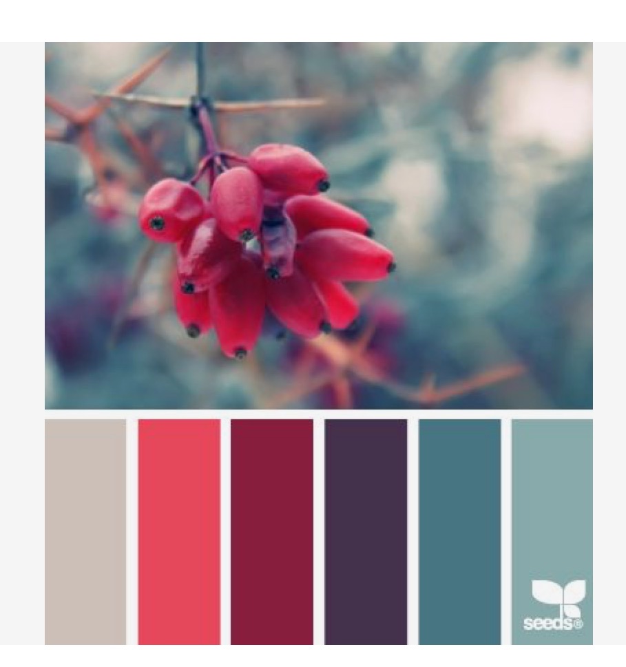
Cuando elijas una paleta de color, fíjate no únicamente en los colores y la manera en la que armonizan...ve en la fotografía cómo se aplica el acento y llévalo a tu dibujo para colorear. Fíjate en esta paleta elegida de Design Seeds (Una de mis favoritas y que está en mi tablero en Pinterest). El acento se representa en la fruta y los dos colores anaranjados. El color predominante es el azul en sus diferentes opciones. El naranja es color complementario del azul en el círculo cromático, pues están exactamente opuestos uno a otro.


Cuando elijas una paleta de color, fíjate no únicamente en los colores y la manera en la que armonizan...ve en la fotografía cómo se aplica el acento y llévalo a tu dibujo para colorear. Fíjate en esta paleta elegida de Design Seeds (Una de mis favoritas y que está en mi tablero en Pinterest). El acento se representa en la fruta y los dos colores anaranjados. El color predominante es el azul en sus diferentes opciones. El naranja es color complementario del azul en el círculo cromático, pues están exactamente opuestos uno a otro.

Esto quiere decir que tu color de acento, o dos colores como máximo, no deben de llenar tu dibujo de color y ser predominantes. Deben de usarse en pocos lugares de tu dibujo para que no se convierta en el color dominante..
En la segunda parte de esta entrada, verás un ejemplo de acentos con un dibujo para colorear que tomé del libro Summer Midnights de Hanna Karlzon. Este es un avance:

Referencias:
Gurney, J (2010). Color and Light. Pg:118-119. Andrews McMeel Publishing, LLC: Kansas, City.
_____________________________________________________________________________
When using color palettes from the Internet (Pinterest has pinboards with these palettes) it is important to choose not only a palette, but the accent. An accent is this area of color that is different from the rest of the composition (Gurney, 2010). In other words, it is this area highlighted attacted to the eye. The colors used in accents are complementary, or near complementary, colors of the dominant color. They are also more vibrant.
When you choose your palette, pay attention to the picture (not just how colors harmonize), see how the accent is used, and take the idea to your coloring page. Look at this palette choosen from the site Design Seeds (it is one of my favorites on my Pinterest board). The accent is the fruit and its two orange shades. The predominant color is blue in all its options. Orange is a complementary color of blue on the chromatic circle, as they sit opposite from each other.

This means that your accent, or two accent colors, should not be dominant on your coloring page. This accent color, or colors, should be used in small areas.
In the second part of this post, you will see an example with accents used on a coloring page from the book by Hanna Karlzon, Summer Midnights. This is a quick look:

References
Gurney, J (2010). Color and Light. Pg:118-119. Andrews McMeel Publishing, LLC: Kansas, City
jueves, 15 de septiembre de 2016
Escogiendo mi libro para colorear parte 2 / Choosing a coloring book part 2

Una vez elegido el libro que deseo colorear, es importante protegerlo de la luz y el polvo. Los libros vienen impresos en diferentes calidades de papel. Los más económicos pueden tener desde papel bond o ahuesado, y los más caros papel especial para dibujo. El papel de los libros con calidad tiene el suficiente grosor para trabajar con diferentes materiales como lápices de color, marcadores, plumones, o acuarelables.
Si en este momento no tengo el presupuesto para comprar un libro de colorear, puedo buscar en Internet pàginas para colorear de autores reconocidos. Ellos ponen a disposiciòn del pùblico algunos dibujos en pdf que pueden imprimirse en diferentes tipos de papel, y asì disfrutar de esta experiencia.
Lo màs importante es que al comprar un libro, puedas hojear las pàginas y decidir si te gustarìa colorearlo; si no te gusta al hojearlo, hay muchas opciones para elegir. Si estàs comprando en lìnea, entonces puedes ver en YouTube los videos populares de coloristas que hojean las pàginas de varios libros. Asì puedes elegir cuàl te gustarìa comprar.
Así que ya armados con tu libro (o libros) en la siguiente entrada, veremos la mejor opción de lápices de colores para empezar a colorear y practicar. Más adelante hablaremos de otros materiales económicos que te van a ayudar con tu coloreado y te darán buenos resultados.
_____________________________________________________________________
Once you have chosen your coloring book, it is important to protect it from light and dust. The books are printed in different paper qualities. The easy-accesible books cand have common bond paper and not heavy paper, and the most expensive books can have heavy paper made for mixed materials like markers, color pencils or watercolor pencils.
If in this moment I do not have the budget for a complete book, I can look for Internet pages by famous illustrators. They offer free pdf files that you can print, and enjoy the coloring experience.
The most important thing when buying a book is to check the pages to decide if you would like to color them. If you don't like the book after flippig its pages, there are more options at the book store. If you have decided to buy online, you can check the flip-out videos of popular coloring artists, or hobbyist who show pages of those books on short videos. Check them out before you buy.
Now that you have your book (or books), on the next post we will see the best option for color pencils to start practicing your coloring. Later We will talk about other materials that can help you with your coloring, and that give good results. Plus, these materials are not pricey.
lunes, 12 de septiembre de 2016
Escogiendo mi libro para colorear parte 1/ Choosing a coloring book part 1
Con la moda actual de los libros para colorear, hay una locura impresionante en sitios como YouTube donde coloristas, y alguno que otro profesional ponen en video las opiniones acerca de tal o cual libro. También he visto coloristas asombrosos que ponen hasta videos de una hora, o más, con el proceso que utilizan para colorear. (¿Quién tiene tiempo de ver un video de una persona coloreando?)
En fin, antes de emocionarte y pedir los libros que veas en video, o que te coman las ansias por colorear como se ve lo hacen estas personas, necesitas definir que tipo de libro necesitas de acuerdo a tu personalidad:
Si tu personalidad es activa y no puedes dedicarle muchas horas a colorear (aunque sea por relajarse), y te gusta ver los resultados rápido...NUNCA escojas un libro con detalles minúsculos o muy pequeños. Te vas a desesperar y lo vas a abandonar muy pronto. Un libro con figuras florales (grandes), geométricas (como mandalas) sería bueno para ti.

Si tu personalidad es ansiosa, nerviosa y buscas relajarte, y puedes dedicar un poco más de tiempo para poder entrar a ese estado de relajación...ESCOGE libros con mandalas y flores o plantas. Sobretodo aquellas que tienen patrones repetitivos en toda la hoja. Una vez que elijas los colores, no tendrás problemas en terminar el coloreado, ni te distraerá el pensar que color le va a que detalle.

Si tu personalidad es tranquila, te gusta la atención a los detalles y a la calidad; sobretodo, tienes mucho tiempo para colorear a lo largo del día...ESCOGE libros con ilustraciones pictoricas (ya sean muy detalladas o no), libros de películas (hay de Harry Potter, GOT, Dr. Who, etc) Aquí si disfrutarás no solamente eligiendo la paleta de colores, también pondrás atención a los detalles.

En la segunda parte de esta entrada hablaremos de que otras opciones hay para colorear, y que puedas planear tu presupuesto de libros y material.
__________________________________________________________________________
With the trend of adult coloring books, there is a great madness on sites like YouTube where amateur and professional colorists upload videos with their opinions on certain books. I've seen colorists uploading videos of one or more hours to show their coloring process. (Anyway, who's got time to what an hour plus video nowadays?)
Before you go crazy buying coloring books you see on video, or want to color as these people do, you need to define the type of book you need according to your personality:
If you are an active person who cannot dedicate so much time to coloring (even if you want to relax by doing this), and you want to see fast results... NEVER choose a book with small details, or with excess details on each page. You will get tired soon, and abandon this coloring hobby. A book with flowers (big drawings), geometric figures (like mandalas) is your choice.

If your personality is a bit nervy, or anxious, you want to relax, and you can dedicate some time to color during the day...PICK a book with mandalas or figures that are repetitive throughout the page. Once you have chosen your color palette, you won't have problems in finishing the complete page, and nor will you worry about which color fits that tiny detailed petal.

In the second part of this post, we will talk about other options to color, and we will touch the topic of budget for books and material.
En fin, antes de emocionarte y pedir los libros que veas en video, o que te coman las ansias por colorear como se ve lo hacen estas personas, necesitas definir que tipo de libro necesitas de acuerdo a tu personalidad:
Si tu personalidad es activa y no puedes dedicarle muchas horas a colorear (aunque sea por relajarse), y te gusta ver los resultados rápido...NUNCA escojas un libro con detalles minúsculos o muy pequeños. Te vas a desesperar y lo vas a abandonar muy pronto. Un libro con figuras florales (grandes), geométricas (como mandalas) sería bueno para ti.

Si tu personalidad es ansiosa, nerviosa y buscas relajarte, y puedes dedicar un poco más de tiempo para poder entrar a ese estado de relajación...ESCOGE libros con mandalas y flores o plantas. Sobretodo aquellas que tienen patrones repetitivos en toda la hoja. Una vez que elijas los colores, no tendrás problemas en terminar el coloreado, ni te distraerá el pensar que color le va a que detalle.

Si tu personalidad es tranquila, te gusta la atención a los detalles y a la calidad; sobretodo, tienes mucho tiempo para colorear a lo largo del día...ESCOGE libros con ilustraciones pictoricas (ya sean muy detalladas o no), libros de películas (hay de Harry Potter, GOT, Dr. Who, etc) Aquí si disfrutarás no solamente eligiendo la paleta de colores, también pondrás atención a los detalles.

En la segunda parte de esta entrada hablaremos de que otras opciones hay para colorear, y que puedas planear tu presupuesto de libros y material.
__________________________________________________________________________
With the trend of adult coloring books, there is a great madness on sites like YouTube where amateur and professional colorists upload videos with their opinions on certain books. I've seen colorists uploading videos of one or more hours to show their coloring process. (Anyway, who's got time to what an hour plus video nowadays?)
Before you go crazy buying coloring books you see on video, or want to color as these people do, you need to define the type of book you need according to your personality:
If you are an active person who cannot dedicate so much time to coloring (even if you want to relax by doing this), and you want to see fast results... NEVER choose a book with small details, or with excess details on each page. You will get tired soon, and abandon this coloring hobby. A book with flowers (big drawings), geometric figures (like mandalas) is your choice.

If your personality is a bit nervy, or anxious, you want to relax, and you can dedicate some time to color during the day...PICK a book with mandalas or figures that are repetitive throughout the page. Once you have chosen your color palette, you won't have problems in finishing the complete page, and nor will you worry about which color fits that tiny detailed petal.

If you have a relaxed nature, you enjoy attention to details, and you can dedicate some time to color during the day... PICK books with pictorial ilustrations (detailes or not), books based on movies (Harry Potter, GOT, Dr. Who, etc.) You will certainly enjoy choosing your color palettes, and give all your attention to details.


domingo, 11 de septiembre de 2016
Colores suaves / Soft colors
Si eres nuevo coloreando los libros para adultos y, no eres diseñador gráfico o ilustrador seguramente te pone nervioso elegir una paleta de colores. No hay problema, ya hay ayuda en línea.
Design Seeds en su serie Color Sign (si tienen cuenta en Pinterest pueden seguirlos) publican unas paletas de color hermosas que vienen bien para los tan populares libros para colorear destinados al público adulto.
En esta ocasión pongo de ejemplo tres paletas de color suaves que sirven para fondos, flores y hojas.
________________________________________________________________________________
If you are new to coloring adult books, and you are not a graphic designer or illustrator surely you get nervous when choosing a color palette. No problem! Internet is on your side to help you.
Design Seeds in their series Color Sign (follow them on Pinterest if you can) pin beautiful color palettes that suit the trendy adult coloring books.
This time I show three soft palettes that can be used for backgrounds, flowers and leaves.

Colores suaves flores / Soft flower colors
Colores suaves poco brillantes con acentos rojos / Soft colors little brightness with red accents

Colores verdes suaves poco brilantes con acentos en gris. / Soft green colors little brightness with grey accents.
jueves, 8 de septiembre de 2016
Welcome! / ¡Bienvenidos!

Colorear es ahora una tendencia muy popular entre gente de varias edades. Mucha de esa gente no ha tomado un crayón o lápiz de color en muchos años y, se sienten inseguros a la hora de colorear sus preciados libros.
Si está leyendo esta entrada es porque ha adquirido una copia de mi propio libro para colorear (disponible en español de momento) llamado Gatos y Flores. No solamente el libro tiene más de cuarenta ilustraciones para empezar su aventura de colorear, también tiene información botánica acerca de las flores y plantas que están representadas. Ahora con su compra, tiene acceso a contenido exclusivo para ayudarle a mejorar su experiencia al colorear.
Este blog le ayudará con: Paletas de color sugeridas para ciertas páginas, guías paso a paso, tips y técnicas para mezclar el material que ya tiene, ahorrar dinero en material artístico, liga directa al canal de You Tube con videos y tutoriales, artículos interesantes acerca de psicología del color, y más.
Así que sea bienvenido al fascinante mundo del color y, disfrute de los bellos gatos y flores del libro.
________________________________________________________________________________
Coloring is a now a popular trend among people from all ages. Some of these people have not hold a crayon or color pencil for years and feel unsure of how to color their precious coloring books.
If you are reading this post is because you purchased a copy of my coloring book (In this moment only available in Spanish) named Gatos y Flores. Not only this book has forty-something ilustrations to start your journey into coloring, it also has botanical information about the flowers and plants depicted. Now with your purchase, you have access to exclusive contents to help you in your coloring experience.
This blog will hekp you with; Color palettes for the pages, step by step tutorials, tips and techiques to mix the material you have, save money on artistic material, a link to my You Tube channel with videos and other tutorials, interesting articles about color pshychology, and more.
So, welcome to the fascinating world of coloring, and enjoy the beautiful cats and flowers in the book.

Suscribirse a:
Entradas (Atom)